With web apps becoming more prevalent, it makes me wonder where the PC market is really headed. It’s not the apps that concern me, but more the way the apps are designed. Web dev teams have been opting to build in favor of touchpad terminals (think Twitter for iPad), and the standard rules for web design don’t apply as much.
One such rule is page width. There many different layout options, and I’ll show you a few here.
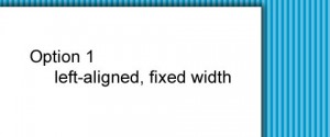
Option 1: left-aligned, fixed width
div#container {

    width: 800px;

    margin: 0px;

}

A page’s default layout allows text to just flow and wrap like a giant, formatted Notepad window
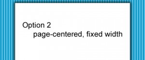
Option 2: page-centered, fixed width
div#container {

    width: 800px;

    margin-left: auto;

    margin-right: auto;

}

